Finally Friday! This week has been a long one! Lots of work to do including the move which wasn’t too bad. It was really cold again here today, I think the high was 15! It was my co-worker Cindy’s Birthday today so we all ate lunch together and that’s always nice. I went straight from work to Scrap-A-Latte to relieve Andrew who had been there since 10:00am. We are babysitting the store while Renee is enjoying the warmer weather at CHA in Anaheim, CA! Lucky!! I closed up at 7:00 and stopped by Brian and Kim’s on the way home to catch up with them. I got home around 9:00 and sat down to make my card for today. Happily finished that and then watched a little TV Before heading off to bed. Not a bad Thursday and it’s back to the scrapbook store tonight. Oh, I also edited the background picture on the homepage so you should actually be able to see the Brooklyn Bridge and the new Freedom Tower too! You’ll have to let me know if I was successful! 🙂
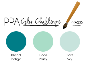
Today I have my card for this week’s Pals Paper Arts color challenge…
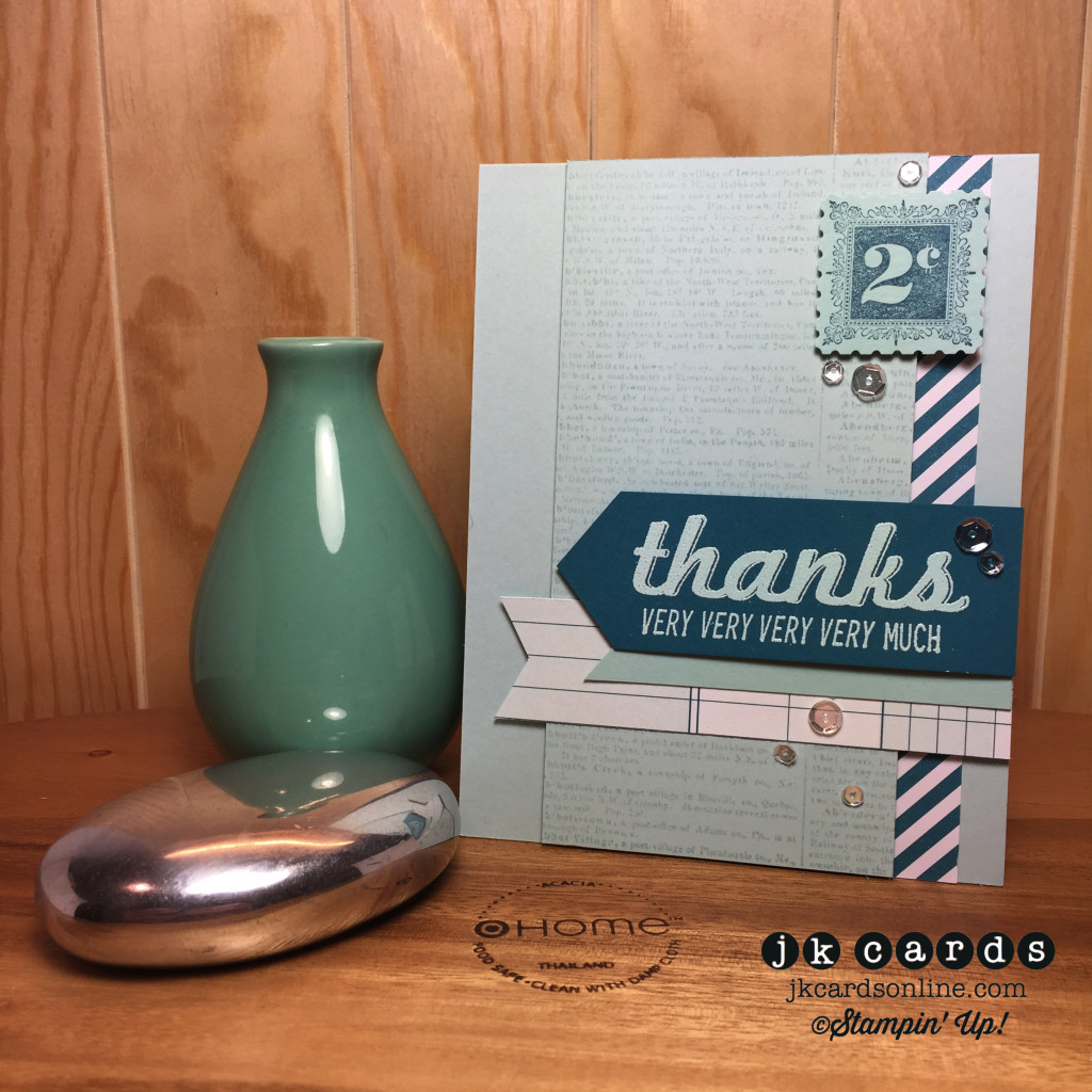
Today’s card is inspired by one that I saw on Pinterest and it begins with a base of Soft Sky Card Stock. I used a piece of paper from the All Abloom Designer Series Paper Stack to go down the right side behind my background which is a piece of Soft Sky that I stamp in Soft Sky with the Dictionary Background Stamp. It’s mounted to the card with Stampin’ Dimensionals. Across the lower half of the card is a piece of Vintage Designer Series Paper, but I not going tell you what it is, lets see if you can guess and leave me a comment just for fun! On top of that is a piece of Pool Party with the left end angled. My greeting is from the Fabulous Four Stamp Set and is heat embossed in Pool Party Stampin’ Emboss Powder on Island Indigo. That and the stamp in the upper right are also adhered to the card with Stampin’ Dimensionals. Speaking of the stamp that’s from the Postage Due Stamp Set and is stamped in Island Indigo. I finished off the card with some Sparkling Clear Sequins adhered with Crystal Effects. A fun simple card for this week’s Pals Paper Arts color challenge and I hope that you enjoyed it! Thank you so much for stopping by to see me on my favorite day of the week! Have a fabulous Friday Everyone! 🙂
Stampin’ Up! products used:
Stamp Sets: Fabulous Four, Postage Due and Dictionary Background Clear Mount
Ink: Soft Sky Classic Stampin’ Ink
Specialty Ink: Versa-Mark
Stampin’ Emboss Powder: Pool Party
Card Stock: Soft Sky, Island Indigo and Pool Party
Designer Series Paper: All Abloom Stack and ???
Punch: Postage Stamp
Tools: Heat Tool, Stamp-a-ma-jig. Paper Snips, Crystal Effects, Stampin’ Dimensionals and SNAIL
NON-Stampin’ Up!: Pretty Pink Posh Sparkling Clear Sequins
Current Promotions:
With our personalized stamps you can create a cool address label or even use it for everything from marking your territory on books or other belongings to having a fun way to give a personal touch to gifts and goodies. Click HERE for a PDF of the flyer.
It’s here! The 2015 Occasions Catalog is ready for you to place your order! It’s packed with fun trendy products and quick kits! Click on the image in the sidebar and place your order today!
Need some cards quicky? Stampin’ Up! has a brand new kit that allows you to create 20 cards, all you need is some adhesive and you’re all set. Click here for the Everyday Occasion Card Kit!
Make your own stamp! New Undefined stamp carving kit. Available now! Click here for the PDF.
Check out all of the Photopolymer Stamp Sets! The newest set is You’re Wonderful. It’s a completely clear stamping option you are going to love!


Love these layers, Justin – and of course it’s perfectly sprinkled with sequins. Thanks for playing along with this week’s PPA Color Challenge.
Thank you very much Brian! You know that I loves me some sequins! LOL! And I know how you enjoy them too! Ha! Have a wonderful weekend! 🙂
Hi Justin, This is one PPA I’m working on. I love blues. When I pulled my ink pads, I was surprised to see how light these three colors are. All the photos I’ve seen the colors look darker or deeper. I’ll see what I come up with.
(FYI . . . Personally, on my computer, I can only see slivers of the back ground picture. If you didn’t tell me, I really wouldn’t have known there was a picture, just a blue background. I do love it peeking through.)
🙂
Hello Nancy!
Yes! The blues are great! They had another one with blues not too long ago too! I think that pictures always make the colors look a little darker. Sorry that the picture still is hidden for you. 🙂
nice card. On my screen I only see bits and pieces of your pictures too.
Thanks MaryJo! I think that it has something to do with the monitor resolution, sorry! 🙂
This card really works- the colors and layers are just right- love those collage cards.
I am only seeing slivers of the background picture too.
Happy Friday Justin.
Thank you very much Marty! Hmm… I will have to take a screen shot of what I see. Friday is always happy! 🙂
Hi Justin and Happy Friday! I can see some of the bridge too. Looks pretty cool, thanks for adjusting that for us. So I do know know the name of the paper you used…in fact, I just pulled it off of my shelf this morning. I’m pretty sure it’s the Sent With Love paper that you loved so much. Now, on to your creation for today! It’s sooo pretty. I love all the blues and I really like the pool party embossing powder on the Island Indigo cardstock. And of course, I love the sequins! So nice of you and Andrew to help Renee out…maybe she can bring some warmth back with her! 😉 Have a great day!!
Hello Karen!
Friday was good! I guess seeing the picture depends on the screen resolution that you have. YES! You are correct! It is still one of my favorite papers and thankful I have way too much of it! LOL! So happy that you enjoyed the card! I too am a huge blue fan and sequins, well we know how I feel about those! The Scrapbook store has been fun! I hope that she does bring some warmth back! 🙂
Hi Justin, great card today (again) 🙂 Love all those blues too…and it’s a color combo I would never have thought to try. I can now see most everything on your blog. To my left is a snippet of a building with a flat on top; to my right is what looks like a bridge, but I can’t tell if it’s Brooklyn or not, as I don’t see any water. I do see the sky and a lot of other buildings. So, it seems to have worked. I believe that your blog posts and columns just block portions of the photo, which is normal. Love the new look anyway! 🙂 Have a super day!
Thanks so much Bobbi! I too love the blues! It’s fun to keep it somewhat monochromatic! Yay! I’m glad that you can see more of the picture! Yes, that’s the way the new blog layout is supposed to work. I had a great Friday and hope that you did too! 🙂
Hi Justin:
I can see parts of both the Brooklyn Bridge and the Freedom Tower. Your blog writing comes through in the center in all white. When I scroll down to write my comments much more of the left side of the photo is exposed. It’s fabulous and I cannot think of anything else you can do to tweak it. At my place it’s beautiful just the way it is.
The card is fab as always. The dictionary background stamp is one of my favorites as it can be used for any occasion that I can think of including the lesser holidays. I love blues so to see these colors so perfectly put together gives the card a soft and soothing look. Then – Bingo – here comes the bling with the sequins! Absolutely perfect!
This week only seemed long to you because the last two weeks were so short! I remember how much I disliked going back to a full week of work after having two 2 and a half day work weeks. I must admit I did like being paid for not working! LOL How lucky you and Andrew are to be in charge of Stamp-A-Latte while the owner is gone. Busy or not you have the opportunity to drool over all the inventory and I’m sure the owner is thrilled to have two people she trusts enough to keep the shop open while she is at CHA. I take it the shop is located on the island and not in Manhattan?
Have yourself a Fabulous Friday and a Wonderful Weekend! Hugs to you my friend! XXOO
Hello Grace!
Yay! Glad that the image is better now! So glad that you like it! I think that it’s a neat layout and there is much more that I can do to customize it, when I have some time to play around with it! LOL!
Thank you very much! The Dictionary Background is definitely a favorite of mine! Have to have my bling!!
You are definitely right about the longer week! Ahh, yes, it’s nice to get paid, even if it’s not really enough for what you do. Lucky to have work, right?! Andrew and I have had fun at the store. The inventory will be much better once Renee gets back and places her orders for new stuff! She has held off, not wanting to have old stock! The shop is located in Babylon on the Island.
I had a nice Friday and don’t have any specific plans for the weekend. I hope that you have a lovely weekend too! XOXOXOXO 🙂
good morning Justin, love the card as always cuz you are the collage master 😉 I can see the bridge in the gaps as I scroll down, is the Freedom Tower the one on the far right?
Hello Lynne!
Thanks so much! I do love a collage card! And yes, that’s the Freedom Tower on the far right! Glad that you can see the picture now! 🙂
Good morning. No bridge shows on my screen and the top of the tower peeks above the bottom of the screen on the right side. Lots of blue sky shows above it. Interesting concept of a post card with the use of the dictionary “page”. Fun.
Have a nice weekend,
CT
Hi Colleen!
I’ll have to see if there is anything else that I can do about the picture. I think it has to do with the resolution that you monitor is set at. I thought that card was fun but eclectic! Glad that you like it! You have a great weekend! 🙂
I do believe there’s a snippet of “Sent With Love” DSP on this beautiful card. 🙂 Love it!
Why yes Barbara! You would be correct! Thank you!! Still love that DSP! 🙂
Hi Justin,
Glad to hear that you have moved into your new office space at work. The colour palette of blues is lovely and sounds very popular.
You are a good friend to go and help Andrew out. I have to say the name Scrap A Latte made me smile.
Hello Michelle!
I’m glad that I am all moved in too! It took long enough! LOL! I do love the blues and these three together are really nice! He’s the best, how could I not help?! I agree that Scrap-A-Latte does bright a smile to the cheeks! 🙂
I think I am writing too much as last couple of times half my message has not appeared once I’ve posted it!
Have a great weekend and love the background photo.
Michelle xo
Oh no! Sorry about that Michelle! You can never write too much!! You have a great weekend too! Glad that you can see the photo now! XP 🙂
Hi Justin, I think they invented this colour challenge just for you, they are colours you seem to use a lot 🙂 Great result, you are so clever with your layers! On my iPad I can see the whole picture if I turn it ‘landscape’ and ‘pinch’ the photo so I can see the entire thing, but on my laptop I can only see the left half of the bridge. Not to worry, I use my iPad mostly. You are lucky to work in a scrapbooking shop! Does the “latte” portion of the name mean there is coffee on offer? That would be one shop I would find it VERY difficult to leave! We have one small scrapbooking shop in our town, I got sprung just before Christmas when I dropped in to buy a star punch for my Christmas cards, and then my car battery died and I had to call my husband! Luckily he doesn’t mind what I spend on my hobby/obsession, Lol. Enjoy your Friday Justin 😀 xxx
Hey Kelly!
LOL! Yes, i do love my blues don’t I?! Thank you! I’m glad that you can see the rest of the picture now! The Scrapbook shop is nice and yes, the latte part means that there is coffee available and even some cookies! It makes the time there more fun! Oh no! I actually got stuck with my car at the old store a while ago! You have a good hubby! Friday was good, hope that yours was too! 🙂
Great job on this card, love those layers. And Postage due is a great set, oldie but goodie.
working n a Scrapbook Store, OMG! I’m jealous, of course I would spend my entire check so i could never do it.
Thank you so much Linda! I need to “dust” off the old sets every now and again! Thankfully there isn’t much in the store just yet, but there will be soon! 🙂
So perfect! Nothing surplus, nothing missing.
My man Justin! Every single card you ever make takes me breath away! You always make color challenges lookso easy. =) I’m so happy you always play with the Pals Paper Arts Color Challenges! Woot and my first one as a team member! =) Love you!
Hello Maggie! Yay! Thank you so much! LOL! I’m glad that it comes across that I make them look easy! LOL! Love playing along with you guys! Congrats on your new gig!! Can’t wait to see your cards each week! Looking forward to Orlando! Love you too! 🙂
A wonderful card, Justin! You balanced the use of the challenge colors perfectly and made it look easy. This is an awesome layout, and works perfectly with this set. Of course, the sequins add the perfect touch of bling. Thanks for joining us this week at Pals Paper Arts!
Thanks very much Ann! I actually love the challenge colors, they are great! Every card needs a little big, right?! Have a wonderful week and I’ll see you soon! 🙂